Brandon M Lynch Introduction
To Computer Graphics
Professor Groat Art/Com
125-01
Everyday
people see ads between their favorite TV show/movie. Perhaps it was from a
billboard or a magazine that caught your eye. The effect you have when you seem
to be sucked into this billboard or a picture of really nice sneakers you just
want to buy right then and now. This effect is done with the rule of thirds.
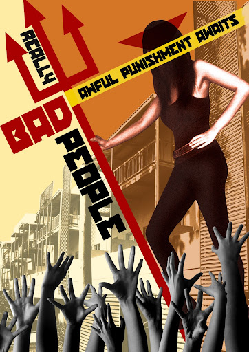
The rule of thirds creates a pattern in which equals out to infinity that can
be implemented into graphic arts. Using the rule of thirds we can draw the
person into whatever we choose to draw them into. Although this rule is set we
need the help of six magic words. Emphasis, contrast, balance, flow, alignment,
and repetition. With these words we can EMPHASIS the object we want people to
buy. Then we can contrast the object to make it more apparent; We can balance
the objects and the words to make it not too lop sided and with elegant flow
and alignment we can bring it all together to repeat (repetition) it all again
to make it really stick. Emphasis is used to make the object we want apparent
well apparent. By making the object bigger and stand out that draws the eyes
attention. Using contrast we can make the object stand out even more. We want
to draw the people away from the object to start our round-about. Balance is
used to make sure our piece is in well proportion so we don’t cause a “sink
hole effect” that will leave our viewers stuck in the negative zone. The use of
flow brings our viewer around our design and alignment is to make key objects
in the design align to make it more organized. Then we complete our circle by
repeating several effects to bring the viewer back to the main point and around
again. Emphasis should be the focal-point of the design. Using the word
emphasis to define emphasis without explaining it is actually really simple.
Just make emphasis the focal-point, make those eyes of ours be drawn to it out
of everything else. We want the design to be different so we will invoke the
use of contrast with opposites. Like making half the page white with dark
lettering and the other half dark with light lettering. Balance is key. We
don’t need viewers feeling stuck too one side of the design so we will balance
it out. Using flow we can move the viewer around the design and repetition
follows to make this trail known throughout the design. Align the design so
that all our key points line up so when flow shows you the way to go all your
keys are organized and have a defined purpose. The six words and the rule of
thirds are all equally important to creating a professional design. Be wary to
not make your design too busy.


 <
<